Carbon dioxide is stealing our oxygen

Our air is getting news coverage today, as the benchmark atmospheric carbon dioxide measurement at a spot in Hawaii has passed 400 parts per million, probably for the first (non-volcanic) time in at least hundreds of thousands of years.

400 ppm is an arbitrary benchmark, relevant to primates with ten fingers.  It’s still important; it’s the atmosphere we must breathe.

From plots like this, it’s clear that the carbon dioxide content of our atmosphere is rising. It is probable that the rising temperature of the globe, the loss of Arctic ice, and the melting of our precious glaciers is related to human activity. I’m a cautious scientist; I’d like to see this experiment played out with many Earths and many rises of civilization to be sure. If forced, I’d have to bet on the prevailing scientific view that human emissions are driving global warming.

That’s not what this post is about. The rise of ~100 ppm over the span of the plot above has an alternate interpretation. 100 ppm is 0.01% of the atmosphere. That’s not a lot. But, our atmosphere is only one fifth (20.946%) oxygen, so it’s an effect that’s at least five times larger. Our oxygen is being burned into stuff we cannot breathe. Continue reading

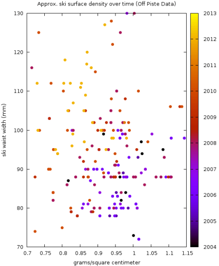
Ski Density

A thread over on Wildsnow got me digging back into the Off Piste data set. While in the past, I’d looked at weight per unit length vs girth, it’s also possible to plot against surface area (or surface density).

opSkiArea

The ski surface area is computed with a formula which is both atrocious and practical. If M is a ski’s mass, S is the width of the ski shovel, W is the waist, T is the tail, and L is the length of a ski, then the density D plotted on the horizontal axis is

D= \frac{M}{( S + 2 W + T) \times L / 4}

Be certain that you’ve used the right units (grams and centimeters, even for the width dimensions).

This treats the ski as two trapezoids, joined at the waist. This will tend to over-estimate the area of a ski, and hence underestimate its density. Relative comparisons of skis should be more accurate than the absolute density determined by this method. With densities determined this way, it would appear that anything in the 0.7-0.8 g/cm^2 realm is light by modern standards.

The Dynafit Cho Oyu’s claimed weight/dimensions would put it at 0.60 in these units (note that the pintail will pull the “trapezoidal density” down. Prototype skis from Ski Lab would land in the 0.64 realm.

Vertfest

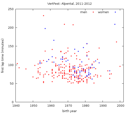
Vertfest is fast approaching, and plot-planning precedes performance, or something like that. Vertfest is an annual ski-mountaineering race held at Alpental and other venues. Alpental is closest to home, and most consistent. The race is split into roughly two divisions: a recreational route that goes to the top of the mountain and back down, and a race route that makes a second lap up and down a nearby knoll.  Am I fast enough to avoid the cut on the race route? Don’t know – experiment is the arbiter of truth.

But first, an overview:

vertfestOverview

Age is largely irrelevant. Gender doesn’t matter much either. Savvy skills are the way to go fast.

Continue reading

Vasa

The skate skiing hook may have been set – it turns out that skate skis are fun going downhill too. A perusal of available nordic skis reveals a preponderance of skis from many manufacturers all labelled ‘Vasa’.

What, where, or who, is Vasa? The man who led Sweden to independence was Gustav Vasa. A 90 km ski race that follows a historically important route is called the Vasaloppet (think the original Marathon). The race is huge, and the mass start is incredible.

Whence Vasa on every ski? I’m not certain. This post suggests that mass-start skis are labelled Vasa. If you’ve more information, please leave a comment! (thanks!)

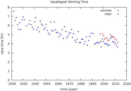
It wouldn’t be a measuredmass post without a plot; here are the winning times since 1922, as found on Wikipedia.

vasaloppetWinningTime

Solstice Musings

On one of the last ski lift rides of Christmas Day, the question came up, “I wonder how much longer today is than the Solstice?”

Between the two of us, we knew two things. One was that a friend had posted on the Solstice, “Happy solstice!!!! 4 extra seconds of daylight tomorrow, then 10 the next day…”  The other was that on January 29, the day is about an hour longer.

Susan’s intuitive guess was about a minute. How could we make an informed guess before the end of the chair ride?

Continue reading

UW Crime Notifications

This afternoon, the University of Washington Police emailed another “Notification of a Criminal Incident” (a student was robbed for $20 and a six-pack of Dr. Pepper).  I forwarded it to a friend north of the University, and she replied, “Remind me never to walk south from my house after 11 p.m.”

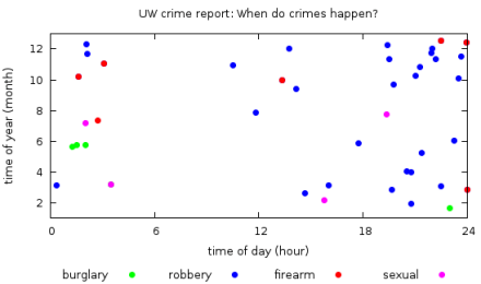
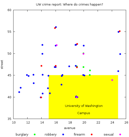
That got me wondering. When do these notable crimes happen, and where? In email archives, I found 47 emails from the last 2.3 years.

When do crimes happen near campus?

Where do they happen?

I added ~1/2 block randomness to spatially separate multiple crimes at the same location.

Off-Piste 2012

What can we see if we look at this year’s skis alone (see previous ski post for year-to-year retrospective)? All of these points are drawn from Off-Piste’s 2012-13 backcountry ski review. OP chose not to review any skis narrower than 90 mm this year.

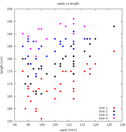
What ski sizes are available?

In the plot above, if a manufacturer only offers a ski in one length, it’s ‘size 1’. If they offer skis in multiple sizes, each size gets its own point. 112mm waists get a little extra love; DPS look-alike contest?

Continue reading

Ski Evolution

At the Northwest Snow and Avalanche Workshop this weekend, Off-Piste Magazine handed out free copies of the October issue as usual. Thumbing through the ski review, I couldn’t help but wonder: How have things changed over time?

Thanks to Off-Piste’s deep archive of back issues, only tedious retyping was needed to find some answers.

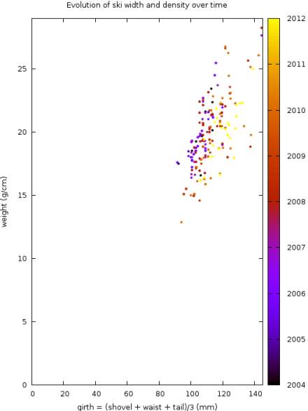
This is the money plot:

The absolute scale makes the scatter part of the plot small, but you can see by exactly how much skis have widened and lightened over time.

For zoomed in plots and more, head down the rabbit hole. Continue reading

Free Bagels

Free food is a standard perk/fact in the modern software industry. It saves people time, lets them focus on work, and makes them feel appreciated.

It works for Google, but can it work for our academic lab of ~50 people? Will ravenous students eat infinitely many bagels? How much does it cost to provide free food to employees?

Experiment is the arbiter of truth.

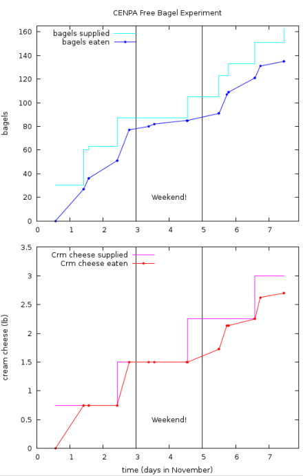
An email made it known that 30+ bagels a day would appear in the breakroom for at least a week, and I kept a tally of bagel consumption over time. Sufficient attention to supply ensured that we never ran out.  Happy bagel eaters were skeptical at first (“Are these really free?”, “What’s with all the bagels?”, etc.), and then hopped aboard the plan.

The answer? ~27 bagels/day, or less than $15/day. Cream cheese is ~30x more popular than butter.

It’s a rather inexpensive experiment (bagels averaged <$0.50 cents each), and it’s provided the faculty with the information they need decide whether or not they could fund such a program.

Best of all, it was fun!

Storm Surge

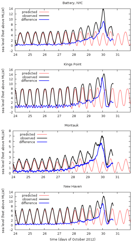
Thanks to the excellent data/interface provided by NOAA (click here for Montauk data), I was able to throw these plots together.

I have family on Long Island. As I understand it, if Hurricane Sandy’s storm surge is more than ~6 feet above high tide, the house will flood. So, I’m interested in the current ocean level. It’s still early in the storm, but the plots don’t look good.

For realtime updates, click the NOAA link above.

Plots updated 10:45 AM PDT 10/30/2012, final update. Status of the house is unknown, but everyone’s fine. Note small after-surge that’s happened today. Neat.

Measured sea level at  The Battery, Montauk, Kings Point, and New Haven during Hurricane Sandy. Data are NOAA measurements. ‘MLLW’ is “Mean Lower Low Water”

Good luck to everyone on the East Coast!